

Check out my Tableau dashboard!
Project Overview
For my first Tableau project, I decided to use data on the books I’ve read in 2024 so far to create a dashboard of reading-related stats and charts.
Data
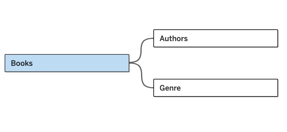
The data was contained in an Excel file with 3 sheets: Books, Authors, and Genre.
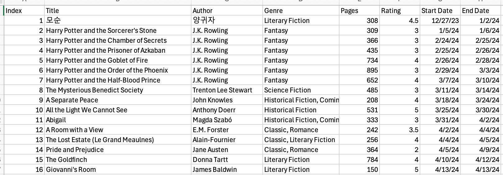
The Books sheet was made up of 8 variables and 42 observations and contained information on each book I read, including the book title, author name, number of pages, rating, and more.
The Authors sheet had 4 variables and 29 observations for each of the authors I’ve read. It includes information about the authors’ gender, country of origin, and race. It was joined to the Books sheet by the Author column.
The Genre sheet contained 3 variables and 61 observations and was the result of splitting the Genre column in the Books sheet into separate rows. It was joined to Books by the Index column.
The following images show fragments of each Excel sheet:


Dashboard
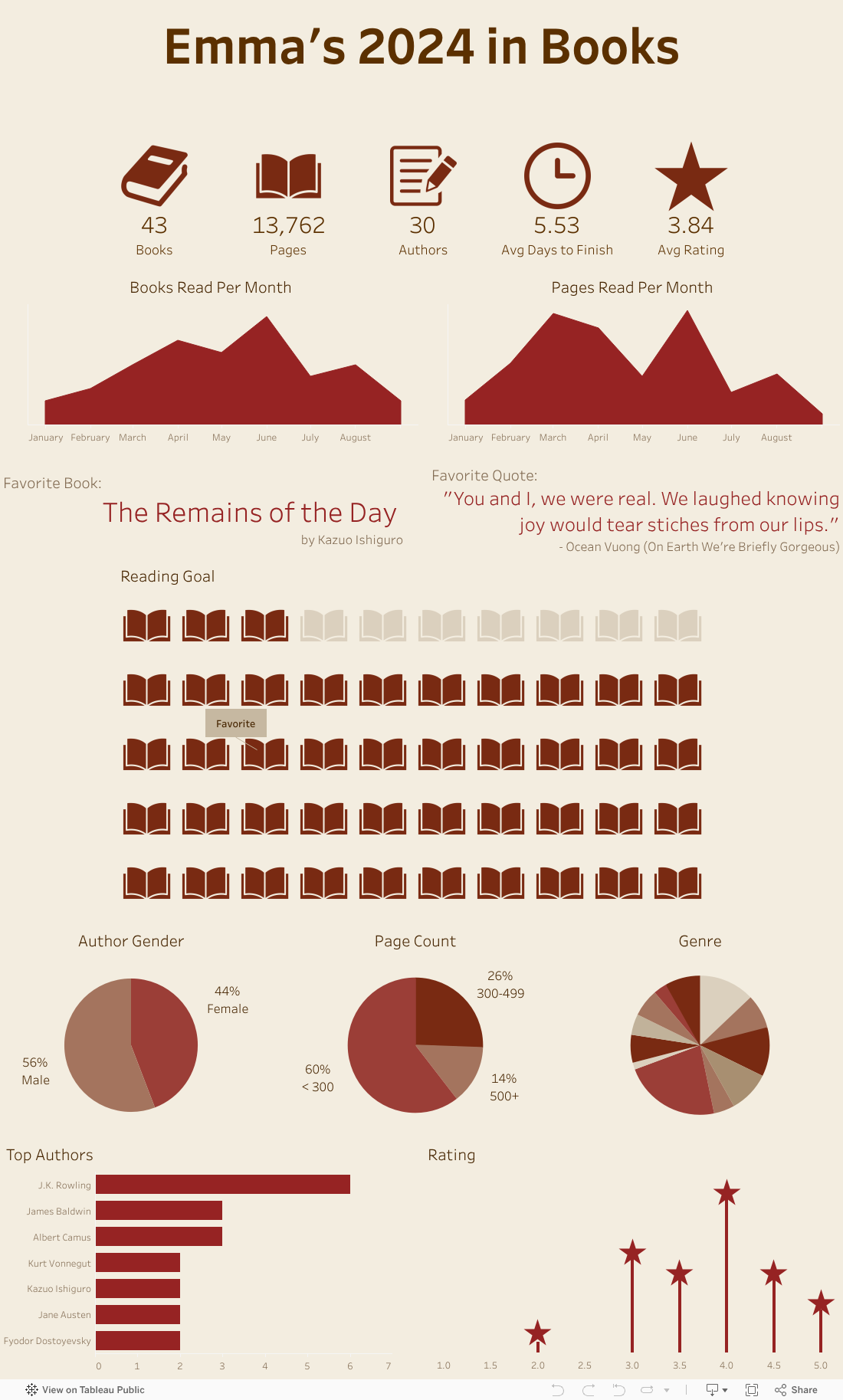
Using the data, I created a dashboard of visualizations that provide insights about my reading habits and preferences. The bottom 5 charts (3 pie charts and 2 bar charts) also include an interactive functionality that allows the users to highlight the corresponding books in the Reading Goal waffle chart with the selected category. For example, the user can click on the Female portion of the Author Gender pie chart to highlight the books that were written by female authors in the Reading Goal chart.
The following image is a snapshot of my dashboard. Click on it to explore the visualization on Tableau Public:
Check out my Tableau dashboard!

Leave a comment