

Check out my GitHub repository for more information and source code of the project!
Original collaborative GitHub repository (unedited)
- Project Overview
- Data
- Exploratory Data Analysis (EDA)
- Interactive Visualization App
- Text Classification Model
- Time Series Forecasting Model
Project Overview
My CHI. My Future. is a youth initiative for the City of Chicago launched in May 2020 to connect young people, ranging from the ages 0-24, with out-of-school programs. The aim is to create a city-wide and community network for nearly 350 organizations and youth to easily discover and cultivate their passions and talents, as well as strengthen and center their identity and voice.
The goal of this project is to visualize the equity of opportunity for the City of Chicago’s youth to have access to and participate in local out-of-school programs across the city’s diverse neighborhoods and communities.
From the data we have, we want to understand how equitable the youth opportunity landscape is across geography by age and category. Do youth in different communities/regions have the same access to similar types of programs?
Since online programs technically serve all geographic regions of Chicago, we will separately analyze online programs and compare the results with those from in-person programs. However, we do acknowledge that the engagement and experiences vary between the different program types.
We also aim to use machine learning modeling and time series analysis to assist the MCMF initiative in accurately and efficiently categorizing their out-of-school programs and forecasting program count.
Data
My CHI. My Future. has over 350 providers, including the Park District and Public Library, that each offer thousands of community programs. Therefore, the database is quite vast, consisting of 56 variables and over 80,000 observations
Providers are required to specify information about their opportunities, which include the program name, description, organization name, minimum age, maximum age, meeting type, start and end date, and program price. Other variables also include category, capacity, URL, free food available, etc.
The data organizes these opportunities into 4 types:
- Programs: lasting five days to a year or recurring
- Events: four days or less
- Jobs: work and career, paid opportunity
- Resources: longer than 1 year
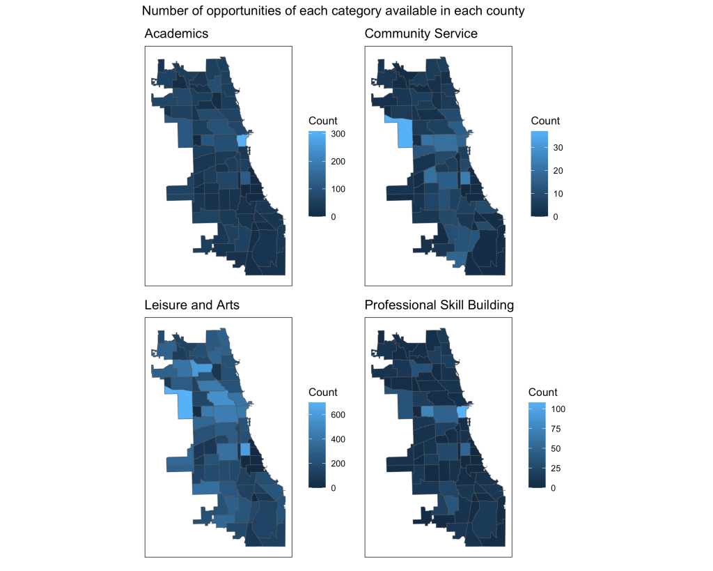
There are also 22 categories that the opportunities are divided into. For our visualization and analysis, we combined them into 4 general categories:
- Academic
- Community Service
- Leisure & Arts
- Professional Skill Building
We acquired the geospatial data for Chicago communities from the City of Chicago’s Open Data Portal:
https://data.cityofchicago.org/Facilities-Geographic-Boundaries/Boundaries-Community-Areas-current-/cauq-8yn6
Exploratory Data Analysis (EDA)
Data Wrangling
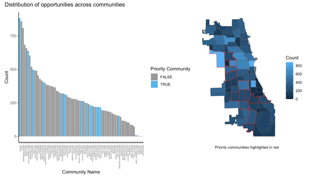
The data required extensive cleaning and wrangling. There were many unhelpful variables and variables with extreme missingness issues that were removed. We also dropped observations with minimum age > 24 (not for our target audience), face to face observations without address and coordinate data (unable to map), and non-Chicago observations. We also created new variables including a general category variable, minimum and maximum grade variables using minimum and maximum age, and priority community factor variable. We used geospatial data from the City of Chicago’s data portal to impute missing community values and allow mapping. Finally, we had to get rid of duplicate observations.
Visualizations
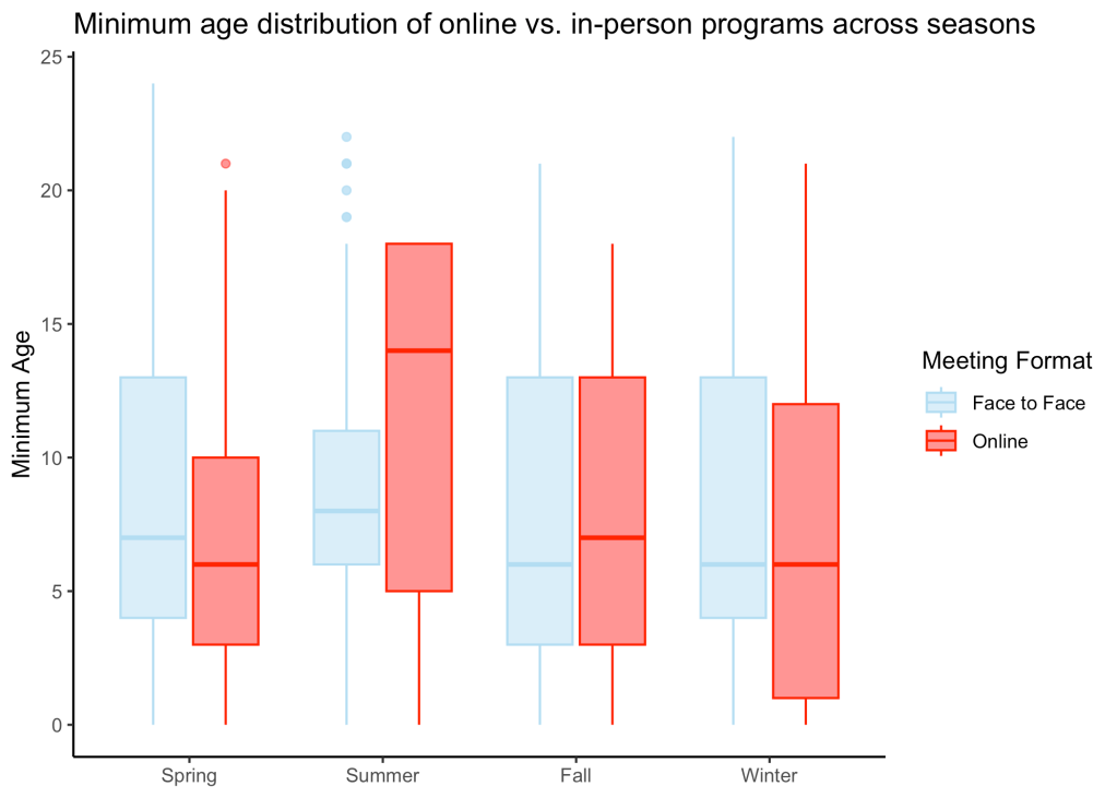
The following are some of the visualizations I created during EDA. Click on the images to expand.
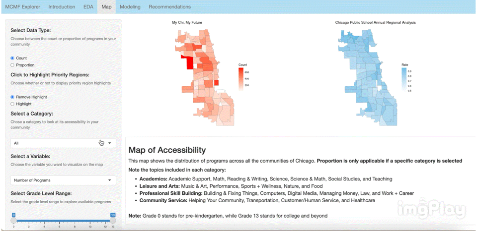
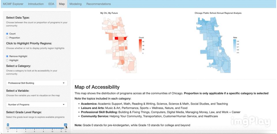
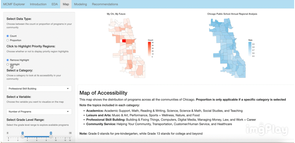
Interactive Visualization App
Link: https://2r7ec0-emma-yu.shinyapps.io/mcmf_map/
The interactive visual map allows the user to click through a variety of options to see how MCMF programs are distributed across Chicago’s communities. The following images show a few ways users can play around with the map.
Text Classification Model
Techniques
The following are techniques I implemented in my modeling to improve performance:
- Text pre-processing
- Text cleaning
- Stop word removal
- Stemming
- Frequent token removal
- TF-IDF vectorization
- Grid search via stratified k-fold cross validation
- Model stacking
- Logistic regression
- Multinomial Naive-Bayes
- Random forest
- Support vector machine (SVM)
- K-nearest neighbors
Results
1. Evaluation Using Testing Data
| Metrics | Values |
|---|---|
| Accuracy | 0.885 |
| F1-score | 0.733 |
| Precision | 0.811 |
| Recall | 0.680 |
| ROC AUC | 0.945 |
| Hamming Loss | 0.115 |
All of the performance metrics are in the acceptable to good range, indicating that the model is sufficient at categorizing the MCMF programs through their descriptions. Recall is the lowest, most likely due to the imbalance in the data.
2. Evaluation Using Updated Data from 2024
| Metrics | Values |
|---|---|
| Accuracy | 0.848 |
| F1-score | 0.639 |
| Precision | 0.739 |
| Recall | 0.595 |
| ROC AUC | 0.901 |
| Hamming Loss | 0.152 |
3. Evaluation Using Manually-Made Data
I hand wrote descriptions of imaginary afterschool programs to see if the model can correctly predict the category. The True column shows the category I labeled each program as and the Predicted column shows the category classified by the model.
| True | Values |
|---|---|
| Professional Skill Building | Professional Skill Building |
| Leisure and Arts | Leisure and Arts |
| Community Service | Leisure and Arts |
| Academics | Academics |
| Professional Skill Building | Professional Skill Building |
| Leisure and Arts | Leisure and Arts |
| Community Service | Leisure and Arts |
| Academics | Academics |
It looks like the model is good at predicting the categories on completely new data but has trouble classifying Community Service opportunities. This could be because of the imbalance in the training dataset. Community Service was the smallest category in the training data while Leisure and Arts was the largest.
Next Steps
In order to improve performance, I could implement text augmentation (synonym replacement, random insertion/deletion, text paraphrasing, etc.). I could also experiment with a hybrid of random over/undersampling and class weighting. I have tried both techniques separately but saw a decrease in performance (most likely due to overfitting), but I think an appropriate combination of those methods could possibly improve performance. Increasing the number of TF-IDF features have shown to increase performance and if I had the computing power, that is another strategy I would experiment with. However, I would have to be careful not to overfit the training data.
Time Series Forecasting Model
Time Series Data
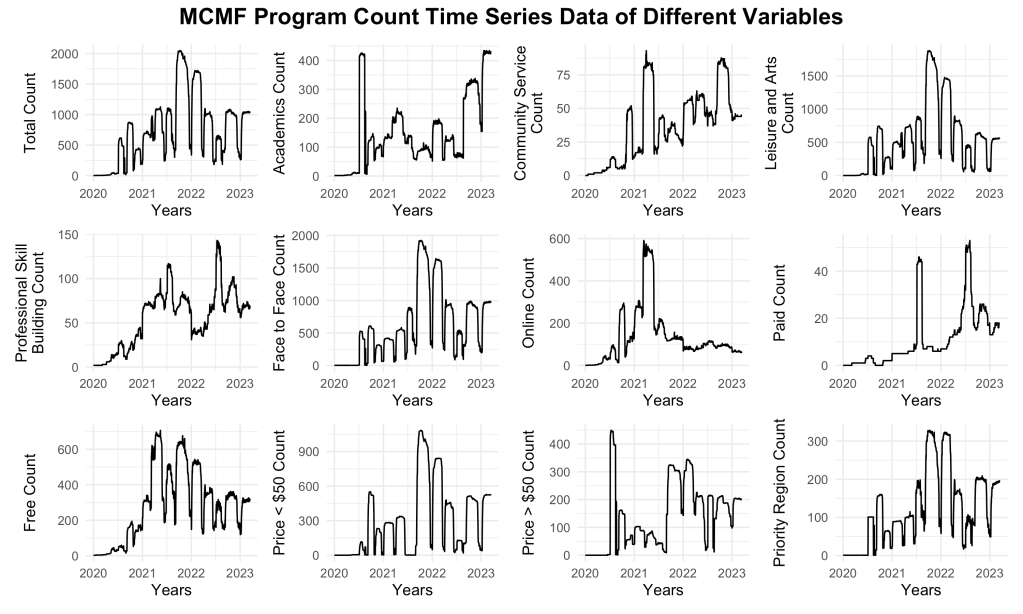
The MCMF program count time series data consisted of daily program count from 1/1/2020 to 3/15/2023. The training/testing cutoff was at 12/2/2021. The plot shows a complex time series with significant dips that seem to display seasonality. The dips are found approximately every 2-5 months, during student holiday seasons (spring break, start of summer break, end of summer break, winter holidays). There is also a general trend of count growth from 2020 to the later quarter of 2021. The program count peaks at slightly over 2000 programs and then displays a decreasing trend. The data also seems to have a moderate amount of volatility even without the dips.
The next figure shows the time series plot of the MCMF program count. I used a 60-40 ratio to split the training and testing sets.

Models Tested
The following models were tested for program count forecasting:
- Autoregressive Integrated Moving Average (ARIMA) model
- Seasonal Autoregressive Integrated Moving Average (SARIMA) model
- Autoregressive Fractionally Integrated Moving Average (ARFIMA) model
The following model was tested for volatility modeling/forecasting:
- Generalized Autoregressive Conditional Heteroscedastic (GARCH) model
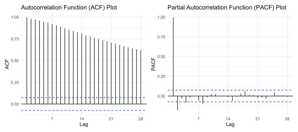
I ultimately decided to use ARFIMA to model the time series data because although the data passed the Augmented Dickey-Fuller test and was proven to be stationary, the ACF plot did not display a significant cutoff. This could be indicating that the data is long-range dependent and ARFIMA is the best-suited model for this type.
Results
Performance Metrics
| Metrics | Values |
|---|---|
| Mean Absolute Error (MAE) | 343.336 |
| Root Mean Squared Error (RMSE) | 402.349 |
| Mean Percentage Error (MPE) | -32.841 |
| Mean Average Percentage Error (MAPE) | 60.986 |
The performance metrics indicate that the model is not completely good at forecasting program count. However, this is expected from running a complex time series data through a model that is used to simpler data.
ARFIMA Forecast
The following plot shows the forecasted data from the ARFIMA model compared to the testing data:

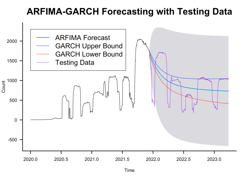
Although the performance metrics were not good, we can see from the plots that the forecast follows the general decreasing trend of the testing data.
ARFIMA-GARCH Forecast
The following plot shows the ARFIMA forecast along with the volatility forecast made by the GARCH model:
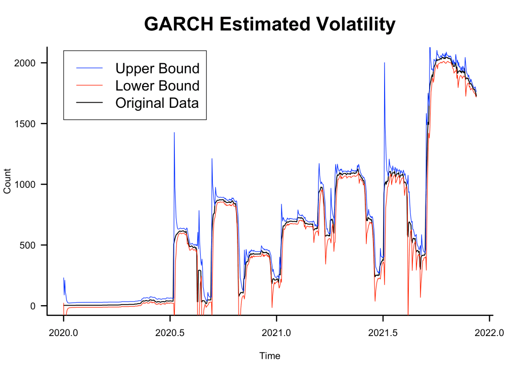
GARCH Variance Bounds
I also plotted the conditional variance bounds against the training data:
Next Steps
The time series data for MCMF programs was very complex, with extreme fluctuations that isn’t captured by simple seasonal differencing, contributing to the inadequate performance. Despite the limitations imposed by the nature of the data, the ARFIMA model was able to accurate forecast the general trend of the program count. In order to create a model that is able to capture the complexity of this data, I could try training a deep learning model such as LSTM. I could also take a completely opposite approach and try a simpler forecasting method such as exponential smoothing.
Check out my GitHub repository for more information and source code of the project!

Leave a comment